Website Redesigns Before & After
Website Redesign
Before and After
Considering a website re-design? That’s a smart move, as it takes just 0.05 seconds for users to form an opinion about your website, and 94% of negative website feedback is often design related.
There are many of reasons why you might need a website redesign. Some of the most common reasons are: To re-brand your site, update the look, increase your traffic, and/or add functionality to improve user experience.
%
93% Of negative website feedback is design related?
- Clean Design & Functionality Supersedes Fluff
- Things to Think About When Implementing a Website Re-Design
Clean design (or minimalism) is one sure trend you can always follow, as clarity and simplicity never go out of style. Turning ineffective design into clean, effective design means stripping away everything that distracts, or interferes with a positive emotional response. When it comes to functionality “Form Follows Function” is just as true for architecture as it is for information architecture.
Tips for Creating a Clean, Minimalist Website
-
- Ensure maximum usability-this includes usability for mobile devices.
- Put the focus on the content of the website–content is still king.
- White Space is our friend. What is white space? An area for the eye to “rest.” We are bombarded with images every day, all day long. The human eye gets tired.
- Ensure everything has a purpose. Bells and whistles -especially in terms of design, are rarely appreciated by website visitors.
- Use a cohesive and limited color palette that matches your brand.
- Intuitive and simple navigation.
Step 1: Analyze your current website
Step 2: Identify problematic areas (think -how can I simplify?)
Step 3: Is the functionality all it could be?
Step 4: Define (or update) your website’s target audience
Step 5: List what is working on your website
Step 6: Make a list of design changes you’d like to see
Website Redesign Before & After | Jo Ann Hartley Interior Design
Jo Ann Hartley is an extremely talented and experienced interior designer. Unfortunately, her outdated website wasn’t reflecting this. Things change fast on the web-even the size and shape of popular monitors can have an effect on how your website displays. You can see how tiny the before website is within a modern monitor. This site was not even usable on mobile (mobile friendly)-a big issue for today’s web users, not to mention Google! Both the style and functionality needed help.
The redesign accomplished the following:
A modern look was created by using large photos of Jo Ann’s work, which simultaneously put the focus on her considerable interior design skills.
Squarespace was the builder of choice, and simplified/enhanced all functionality, including making the website mobile friendly.
Updating the website galleries is now an easy task with Squarespace “drag and drop” photo capabilities.
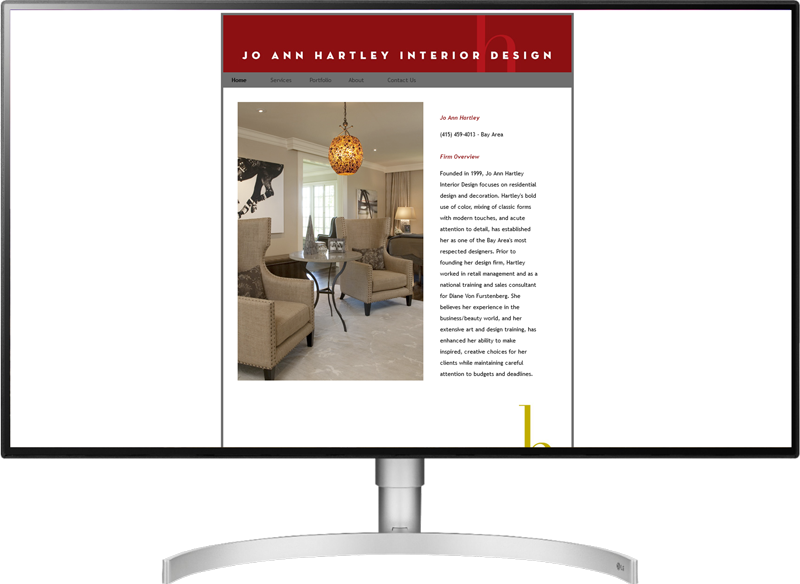
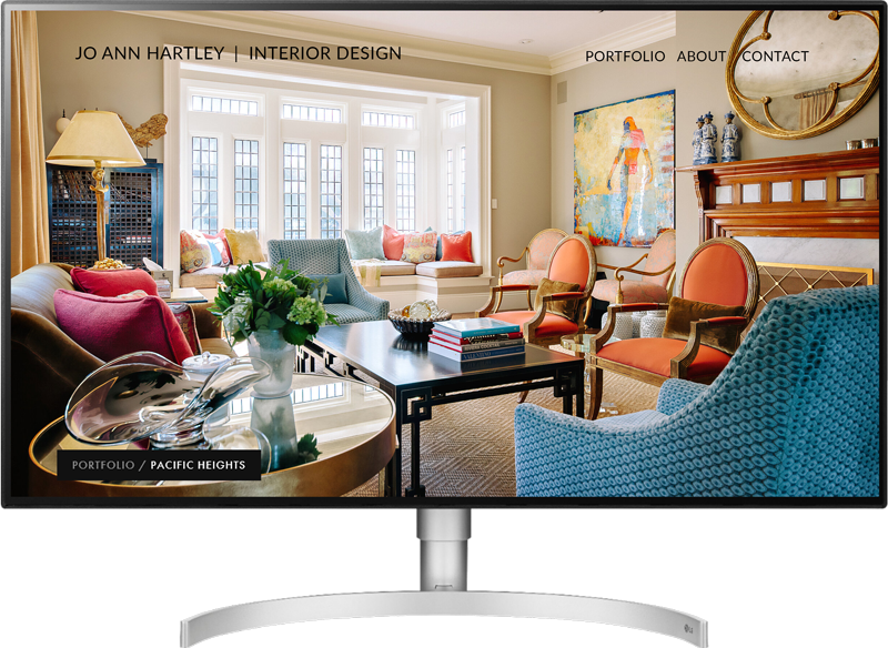
Website Redesign Before & After | Halleck Creek Ranch
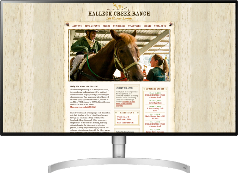
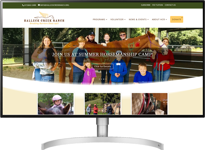
Halleck Creek Ranch is a non-profit that does incredible work for people with disabilities. As such, their website was last on their list of priorities. By the time Halleck approached me for a redesign they could no longer access the back end of the site to make edits, as the code the website had been created with had been completely abandoned by it’s developers. I knew right away WordPress would be the builder of choice, as it’s open source and is here to stay.
The redesign accomplished the following:
- Easily update-able
- Website Accessibility
- Mobile friendly
- Beautiful/contemporary new look
- Calendar of events
- Improved Donation Area
- Better form functionality
Get Started. Sleep better.
Office: 415.925.9061
Email: [email protected]
I would love to hear about your business and what you’re looking to accomplish. Drop me a line, schedule a 20 minute free consultation, or send me an email.
