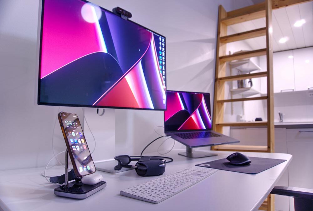
You’ve just launched your shiny new website. You check it on your laptop, and wow—it’s a thing of beauty. The fonts look great, the layout is crisp, and you’re feeling like a tech genius.
Then someone opens it on their phone and… ouch. Text overlapping, images cropped weird, buttons hiding like they’re ashamed to be seen.
Sound familiar?
Let’s talk about Squarespace’s Mobile and Tablet Views—aka your secret weapons for making sure your website doesn’t embarrass you on small screens.
Why Mobile View Matters More Than Desktop (Yep, I Said It)
The truth is, most people are visiting your site on their phone, not a desktop. Think: potential clients scrolling while in line at the grocery store, on their couch, or let’s be honest, during a meeting. If your site doesn’t load fast, look clean, and work well on a phone, they’re gone.
How to Use Mobile & Tablet Preview in Squarespace
- Log in to your Squarespace site
- Head to Pages, open a specific page
- Look for the little devices icon (usually top right)
- Click to preview your site in desktop, tablet, and mobile viewNow you can see exactly what your visitors see—whether they’re on a big screen or holding your website in the palm of their hand.
What to Look For
When you’re previewing your site on mobile and tablet, keep an eye out for:
- Text that’s too small to read without squinting
- Buttons that are too close together
- Images that get cut off or shrink into nothingness
- Stacking issues (like weird order of sections or menus going rogue)
- Pop-ups that take over the whole screen and refuse to leave
Quick Fixes for a Cleaner Mobile Look
- Use section spacing wisely. What looks balanced on desktop might feel crammed on mobile.
- Test your buttons. Make sure they’re easy to tap—not tiny little targets only an elf could click.
- Keep it simple. Less is more on small screens.
- Use mobile-specific tweaks. Some templates and blocks let you hide certain content on mobile or adjust layouts just for phones.
- Try starting out your design in mobile view first. Squarespace’s Fluid Engine allows you to rearrange content specifically for the mobile layout without affecting the desktop version, making it easier to fine-tune the mobile experience.
Bottom Line
Your website needs to work beautifully on every screen—especially phones. Don’t assume it looks good just because it looks great on your laptop.
If your site’s acting up on mobile and you’d rather stick a fork in a toaster than deal with it—I can help.
Contact me and I’ll make sure your website is easy to use, good looking, and fully functional on any device—no matter where your visitors are scrolling from.
